A Students Look at the New Airport
Photo by Ella Thomas
The new and improved KCI airport opened on Feb. 28, just in time for spring break. A few days later, I had the opportunity to fly out of the new airport. I had eagerly been watching the construction, week by week, as I flew out of the deteriorating airport. As I walked into the airport I tried to keep my expectations low but compared to the old airport, it would be hard to disappoint.
One of the first things I noticed as my dad and I drove into the new spacious garage was the green and red lights on the outside of each parking space indicating available parking spots. Once parked and outside of the garage, I realized how short the pickup area in front of the airport is. This has proved to be the most frustrating feature of the new airport, forcing drivers to wait 30 or more minutes to pick up passengers.
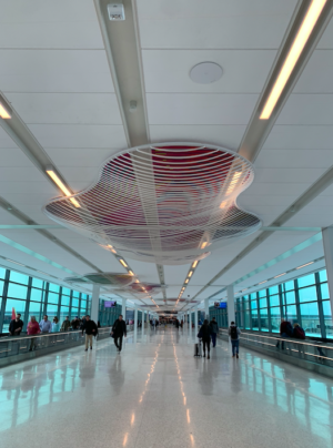
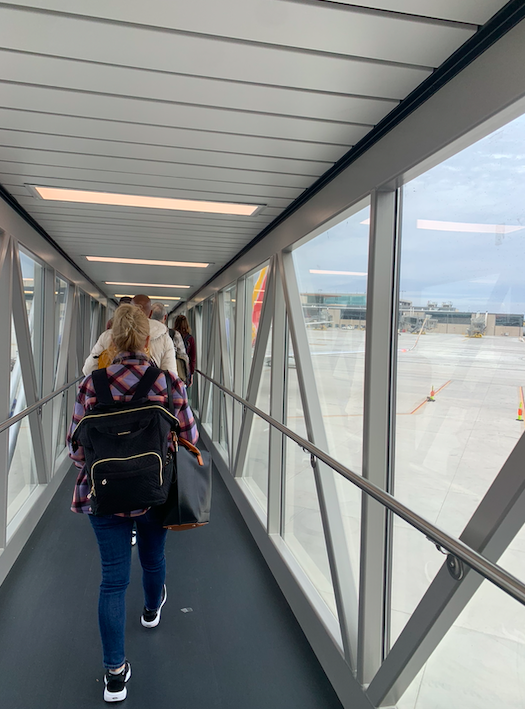
I found the inside of the airport to be modern, spacious and bright with short lines at baggage and security. The windows integrated around the airport not only make the space brighter but let travelers see what is going on around them. As I walked through the gate area and down the glass jet bridges I smiled as I saw kids and families watching the ground crew bustling around the tarmac.
The real magic of the airport came after security where guests are met with a glowing fountain, new stores and entrances to the terminals. Interesting shops and restaurants included a lego store, multiple coffee shops and a barbeque restaurant.

I was originally worried that the new modern design of the airport would strip Kansas City of its charm but I was pleased to see the airport was full of KC allusions. The Chiefs, Royals, Sporting KC and the KC Current sporting teams were all represented via apparel and art. A food truck-themed restaurant was decorated with the logo and colors of the successful KC Current women’s soccer team.
The improved dining options are obvious improvements but the art that decorates nearly every gate makes the airport even better. Most people that I talked to voiced that they would miss the nostalgia of the old terminal but by supplementing the historic and astrological blue floors with art that relates to our city, the designers created a unique story.
There are so many improvements in the new airport but my favorite, by far, is the spacious seating and charging areas. In the old terminal, one was lucky to get a seat that wasn’t torn and littered with old pizza, let alone one with two chargers and room to spread out.
I understand that change is hard and people will miss the “charm” that the old airport had, but I do believe that this airport accurately represents our city. When visitors step off the plane they should see what our city has to offer. As the NFL draft and 2026 World Cup come to Kansas City, we can be proud to welcome them into such a lovely new airport.


